Capital City Oktoberfest
Perfect Pour Studios put on Capital City Oktoberfest, a two-day event that not only offered a more traditional Oktoberfest experience but also celebrated the city of Lincoln, Nebraska. It featured local businesses that are doing great things in the community, including Lincoln’s breweries that headlined the beer lineup .
Project Scope
Brand Strategy
Messaging
Identity System Design
Web Design and Development
Social Media Campaign
Printed Marketing Campaign
Event Planning
Challenges
Because this was an inaugural event we identified two main challenges:
1. Familiarizing the audience with the Capital Oktoberfest City brand.
2. Informing the audience without overwhelming.
Results
Capital City Oktoberfest exceeded turnout estimates. Attendees and vendors overwhelmingly reported their experience as positive and would return next year.
The event overall generated a lot of interest from Lincoln businesses and community organizations looking to become involved or partner with Capital City Oktoberfest.
The Identity System
Capital City Oktoberfest was a brand new event with a unique premise. It aimed at celebrating the community and city of Lincoln within a traditional Oktoberfest experience. The goal is to become Lincoln’s Oktoberfest celebration. With that we knew we wanted three things when developing the CCO identity system.
1. It has to be familiar
2. It has to be recognizable
3. It has to stand out

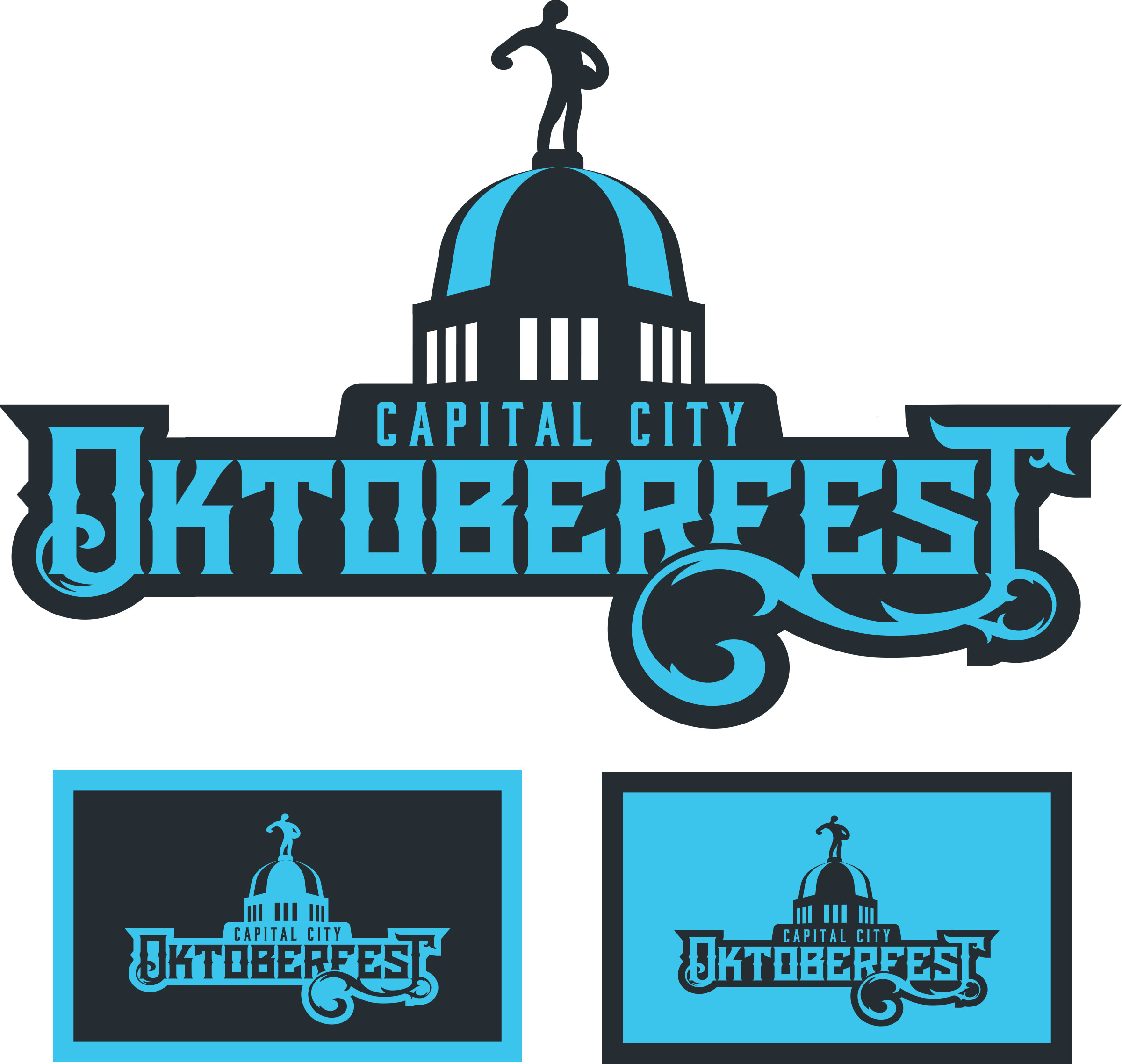
The concept came almost immediately: the state capital building’s dome featuring the iconic “Sower” rising over an ornate Gothic-style text. The dome’s silhouette is immediately recognizable to Lincoln residents and therefore perfect visual shorthand for a Lincoln-centric event.
Traditional Oktoberfest colors are sky blue and white after the colors of the Bavarian flag, home of Oktoberfest. However we wanted the color scheme to be unmistakable and reflexively associated with Capital City Oktoberfest. After much experimentation we landed on sky blue and a near-black shade of that color. This simple palette creates a stark yet appealing contrast that is easily recognizable. This palette forms the foundation of CCO’s visual identity.
The new identity system successfully hits our three requirements.
Crafting A Message
Capital City Oktoberfest is a family-friendly event with games and entertainment that also caters to non-drinkers: there’s something there for everyone to enjoy themselves. Therefore it was very important to differentiate this from other beer-centric events which can be intimidating or unappealing for those whose interests don’t center around beer. Our messaging had to be welcoming and communicate the idea that you can choose how you have fun and experience Capital City Oktoberfest.
We accomplished this by making the community the central focus. Capital City Oktoberfest is a celebration for and about the community.
Marketing Campaign
Capital City Oktoberfest had a limited budget so we had to devise a plan on how to generate meaningful exposure efficiently. The marketing campaign was focused on two main fronts: direct and social media.
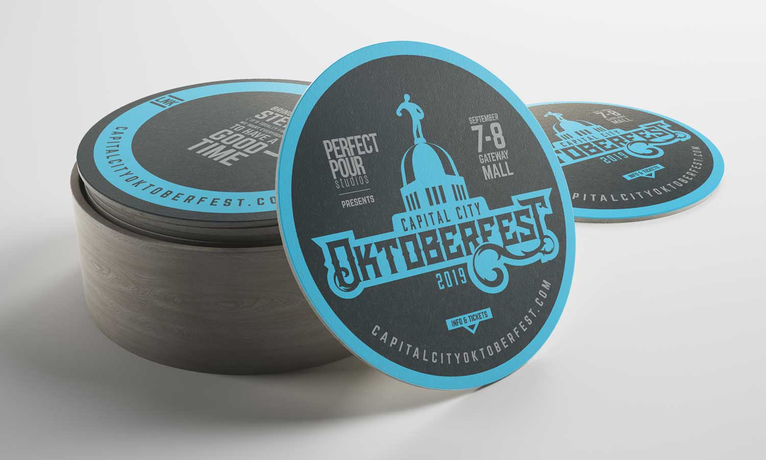
For the direct campaign we decided the best way to get in front of our audience was to have them come to us. At the beginning, through our brand strategy phase, we discovered that a large portion of our audience were craft beer drinkers. It only made sense to reach them by providing all the craft breweries and taprooms in Lincoln with Capital City Oktoberfest branded coasters and stickers. The coasters had basic information and drove people to the website and social media for more information and tickets. The stickers were simply branded with the logo and free to take because people love stickers.
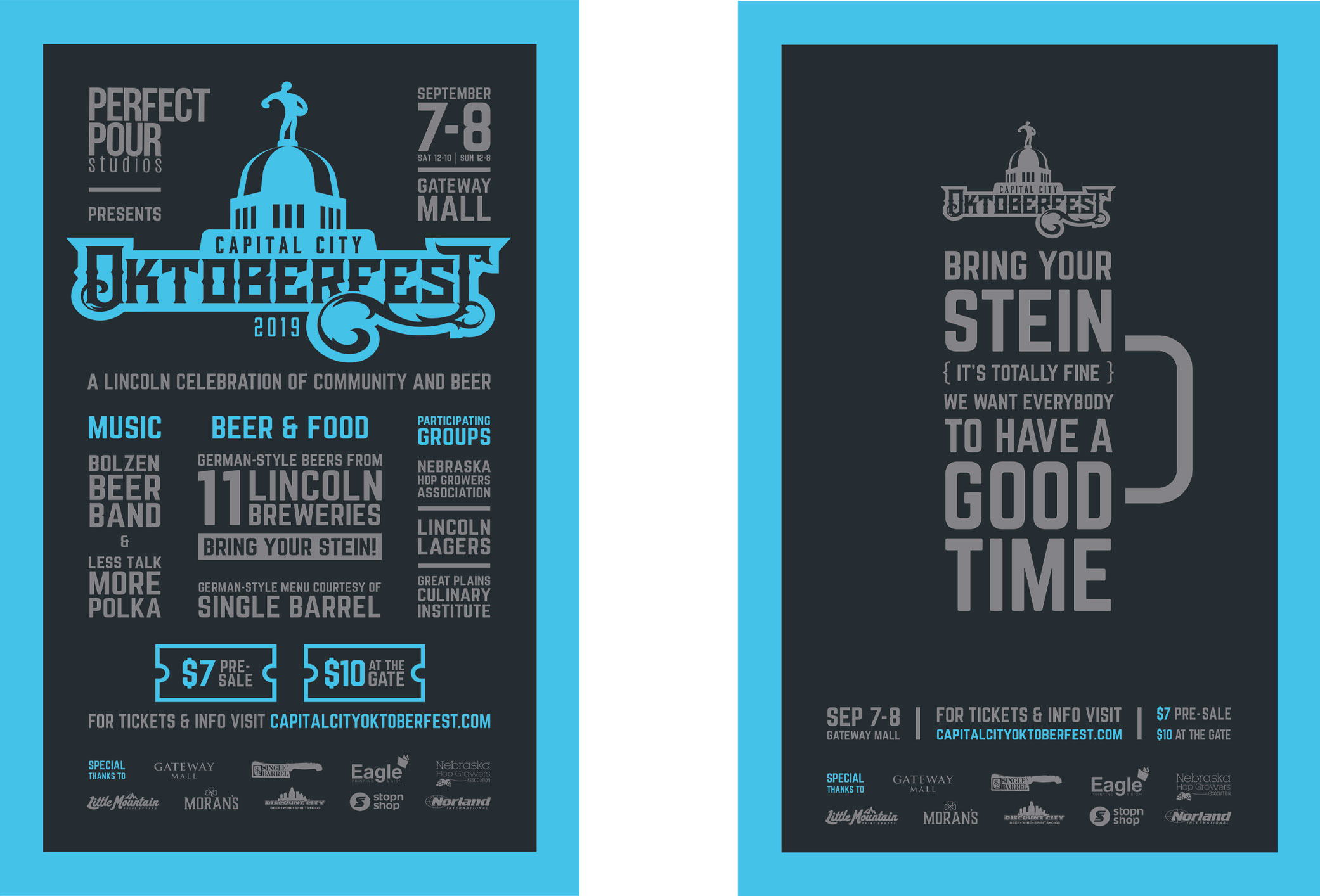
The direct strategy was also supplemented with a series of posters that went all over Lincoln with the purpose of reaching an audience beyond the craft beer scene that would also be interested. Posters were placed in fast food restaurants, coffee shops and shopping centers.


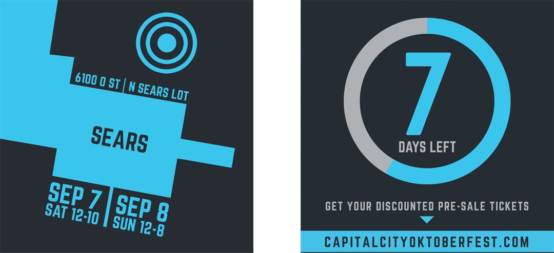
The goal of the social media campaign was to inform and generate excitement. With so many moving parts to a new event it was important to plan out what information to reveal and in what order so as to not overwhelm or confuse the audience. The schedule was designed to deliver information over a specific aspect of the event such as location, the food menu or what bands would be playing. The overall effect was to build anticipation for the next reveal and the event overall.
Want To Work With Us?
Great! Send us a message below and let’s get started.
Say Hello!
And let's talk about your next project.
