
Blue Blood Brewing Co.
Blue Blood Brewing Company was looking to do a complete rebrand of their two largest beer lines: Their main line and the Robber’s Cave Series. The current can designs didn’t stand out and got lost on the shelves next to all the colorful competition. Blue Blood asked us to help them address this lack of visibility that was costing them sales.
Project Scope
Label Design
Marketing Materials
Print Materials
Challenges
Blue Blood was just rebranding their beer lines, not their identity as a whole. We had to create designs that jumped out and owned their space on the shelves while still being recognizable and embodying the spirit of the Blue Blood brand.
Results
Robber’s Cave Series releases sold out faster than any year previous. Distributors, particularly in out-of-state markets, purchased and re-ordered cases at such a rate that unplanned second batches were brewed to meet the elevated demand.
The Blue Blood Main line received similar increased demand. It had earned highly-coveted premium placement on the shelves at supermarkets and bottle shops securing maximum visibility.
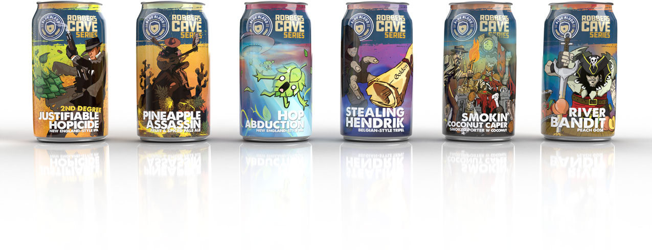
Robber's Cave Series Concept
The Robber’s Cave Series was inspired by the historical system of caves and tunnels located directly below the brewery. Stories claim at one point it had been used as a refuge for outlaws and bandits, including Jesse james, hence the name Robber’s Cave.
The series released a new beer every two months and we saw this as an opportunity to do something cool with it. Our main goal was to make the labels jump out from the crowd, but we wanted to also turn these labels into an experience.
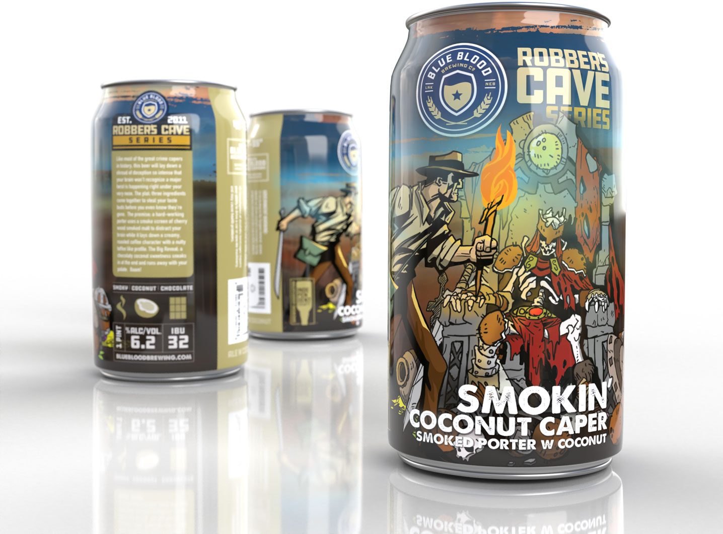
Each label would reflect the spirit of rebellion, mischief and adventure of Robber’s Cave with a theme based on the style and characteristics of that release. We wanted the illustrations to be impressive, fun and unique enough that people would look forward to the next release with curious excitement to see what that would look like.
Main Line Label Design
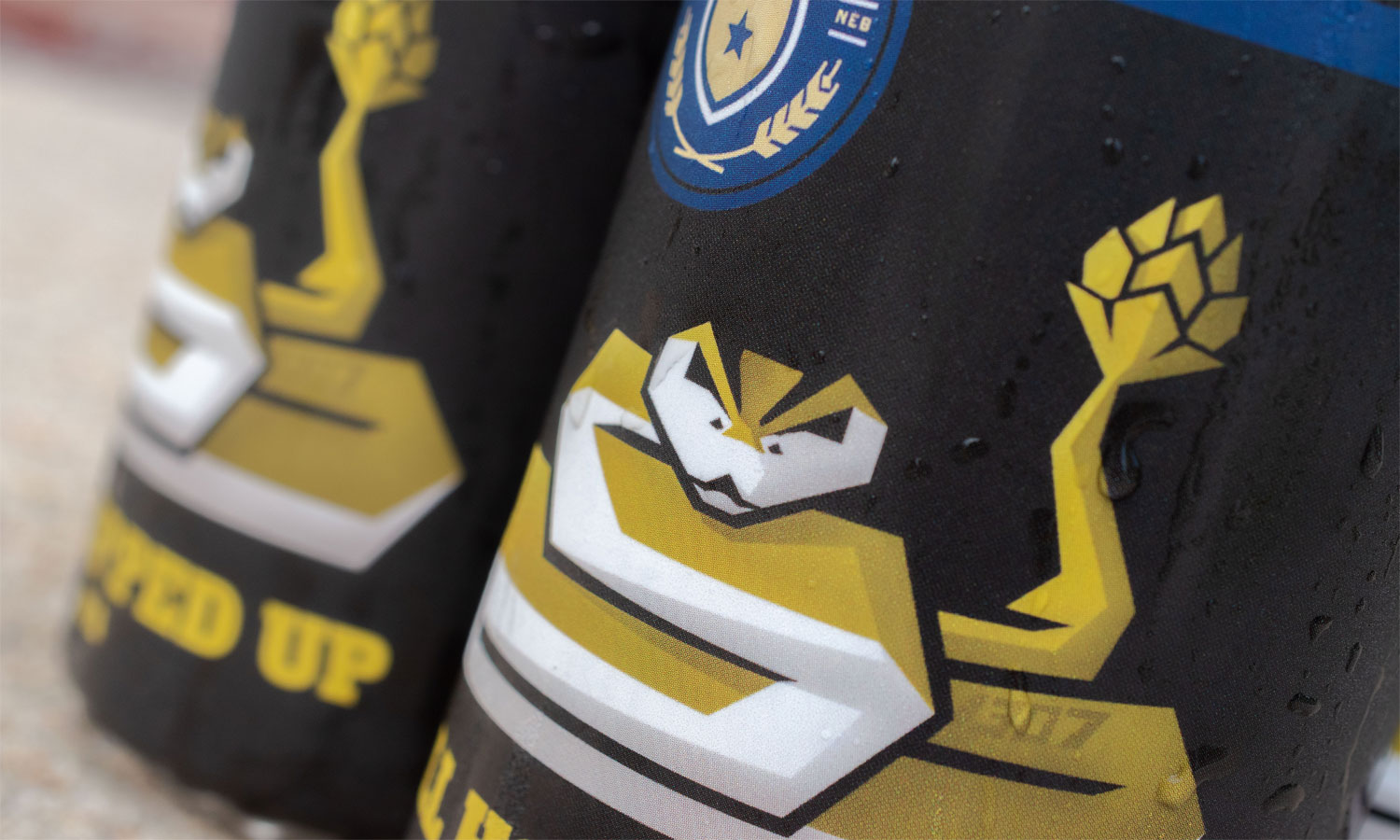
Unlike the Robber’s Cave Series which are seasonal releases, Blue Blood’s main line is available year round. These are their flagship beers that are more closely tied to the law enforcement roots of Blue Blood Brewing, so we knew we wanted to approach these labels a little differently.
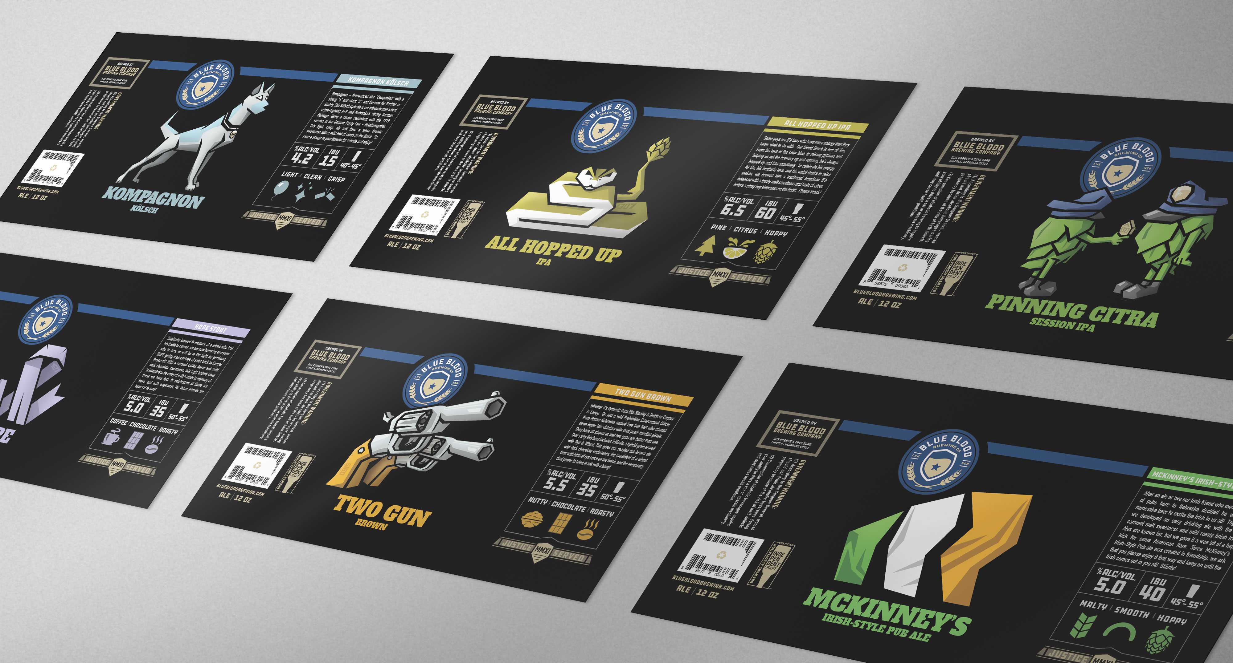
Structurally the labels would seem familiar, echoing the Robber’s Cave Series with a central illustration. Stylistically however, they would look and feel very different. The labels should have a directness, a presence of order, an air of esteem about them reflecting their law enforcement origins.
We started with the background. Inspired by the black and white police cruisers, the black background not only makes the content pop but also commands attention when grouped together on store shelves. The “Thin Blue Line” across the top is the source of orderly structure from which the rest of the elements are organized.
Want To Work With Us?
Great! Send us a message below and let’s get started.
Say Hello!
And let's talk about your next project.